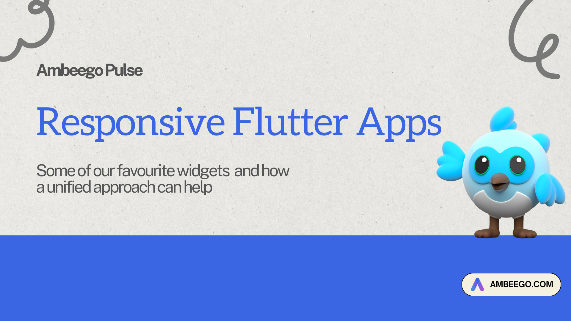
Flutter has evolved from a mobile-focused UI toolkit into a powerful framework for building rich, interactive web applications. Today, with AI agents, Bolt, Model Composition Patterns (MCPs), and context-aware interfaces on the rise, you might wonder: do responsive layout basics still matter?
The answer is a resounding yes. In fact, understanding Flutter’s layout system is more essential than ever. As we begin to integrate intelligent agents and model-driven UI states, a solid grasp of layout mechanics allows you to build UIs that are not just reactive—but adaptive, scalable, and emotionally resonant.
This guide covers responsive design techniques in Flutter and reframes them in the context of modern tooling like Bolt, agent UIs, and lovable app design.
Why Responsive Design Still Matters in 2025
Modern UIs need to adapt across not just screens—but also:
- Device contexts (foldables, desktops, ultra-wide monitors)
- Model states (MCPs triggering different UIs)
- AI-generated or agent-driven layouts
Even with AI composing parts of the UI, developers are still responsible for guiding layout structure, ensuring accessibility, and crafting delightful, context-aware interactions.
Responsive layouts remain the foundation for scalability, personalization, and seamless cross-device experience.
Core Flutter Layout Concepts
1. Widget-Based Layout System
Everything in Flutter is a widget—including layout structures. This composable model makes it easy to encapsulate and reuse layout logic.
2. Constraint-Based Rendering
Widgets receive layout constraints from their parent and size themselves accordingly. This model allows for granular control of layout behavior.
3. Foundational Widgets for Responsive UI
Container: For spacing, alignment, and decoration.Row/Column: Horizontal and vertical layout control.Stack: For overlaying widgets, useful for layering elements.
Key Techniques for Responsive Design
1. Using Flexible and Expanded
Row(
  children: [
    Expanded(flex: 2, child: Container(color: Colors.red)),
    Expanded(flex: 1, child: Container(color: Colors.blue)),
  ],
)
Use Expanded when children should divide space proportionally. This is still valid, even when layouts are chosen by AI or agents.
2. LayoutBuilder: Layout Decisions Based on Space
LayoutBuilder(
  builder: (context, constraints) {
    return constraints.maxWidth > 600
        ? WideLayout()
        : NarrowLayout();
  },
)
Especially powerful when used with state-driven models (MCP) or agent responses.
3. MediaQuery: Get Device Info
final screenSize = MediaQuery.of(context).size;
if (screenSize.width > 800) {
  return LargeWidget();
} else {
  return SmallWidget();
}
Still critical when developing multi-device experiences and verifying AI-generated layout variations.
4. OrientationBuilder: Respond to Screen Rotation
OrientationBuilder(
  builder: (context, orientation) {
    return orientation == Orientation.portrait
        ? PortraitLayout()
        : LandscapeLayout();
  },
)
Essential for mobile-first and tablet-hybrid UIs.
5. AspectRatio: Maintain Proportions
AspectRatio(
  aspectRatio: 16 / 9,
  child: Container(color: Colors.green),
)
Ideal for video players or agent-driven visual modules.
Custom Grids and Staggered Layouts
Responsive GridView Example
GridView.count(
  crossAxisCount: MediaQuery.of(context).size.width > 600 ? 3 : 2,
  children: List.generate(9, (index) {
    return Center(child: Text('Item $index'));
  }),
)
Staggered Layout with flutter_staggered_grid_view
StaggeredGridView.countBuilder(
  crossAxisCount: 4,
  itemCount: 8,
  itemBuilder: (context, index) => Container(
    color: Colors.green,
    child: Center(child: CircleAvatar(child: Text('$index'))),
  ),
  staggeredTileBuilder: (index) => StaggeredTile.count(2, index.isEven ? 2 : 1),
)
Use cases include news feeds, dashboards, and AI-assembled interfaces.
Agent-Driven and Model-Adaptive Layouts
Adaptive Layouts with MCP or Agent State
class AdaptiveContainer extends StatelessWidget {
  @override
  Widget build(BuildContext context) {
    return LayoutBuilder(
      builder: (context, constraints) {
        final currentModel = context.watch<MyComposableModel>();
        return currentModel.isWideView
            ? WideContainer()
            : NarrowContainer();
      },
    );
  }
}
This is where agents and models meet responsive design.
AI + Developer: A Powerful Duo
AI agents can generate scaffolds or dynamic UIs, but as a developer:
- You ensure accessibility, responsiveness, and performance.
- You define constraints, breakpoints, and edge-case handling.
- You guide layout aesthetics to create lovable, human-first interfaces.
Bonus: Scalable Graphics with SVG
SVGs remain important for web UIs:
SvgPicture.asset(
  'assets/my_icon.svg',
  width: 50,
  height: 50,
)
Perfect for icon systems and resolution-independent visuals.
Closing Thoughts: Building Lovable, Scalable, Responsive UIs
Responsiveness in Flutter is no longer just about screen size—it’s about adaptability. Whether you’re reacting to user intent, device size, or AI-driven decisions, knowing the layout fundamentals enables you to build UIs that feel natural, elegant, and scalable across any context.
In the era of intelligent UI, the basics aren’t outdated—they’re superpowers.