If you’ve ever found yourself puzzled by layout errors when developing user interfaces, you’re not alone. Understanding the fundamental principles of layout management can dramatically simplify your development process. Let’s explore a golden rule of layout design that every developer should remember:
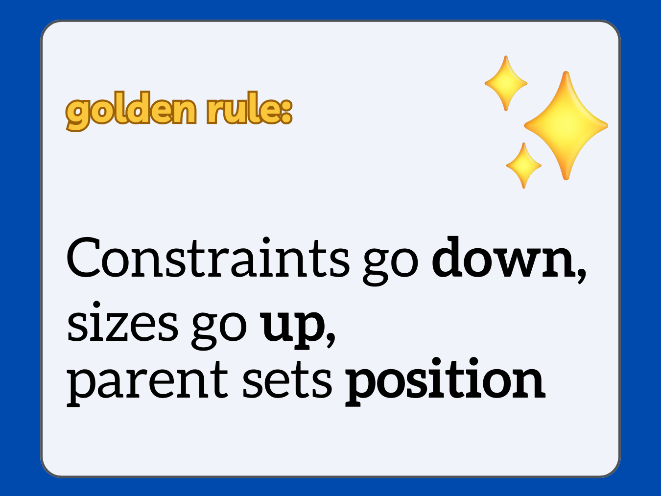
“Constraints go down, sizes go up, parent sets position.”

The Downward Flow of Constraints
The layout process begins with constraints that flow downwards from parent widgets to their children. These constraints are essentially rules set by the parent widget that dictate the maximum or minimum size its child widgets can have. This hierarchical structure helps in maintaining a consistent and logical layout across the user interface.
In practical terms, if you’re working with a framework like Flutter, understanding this concept means recognizing that a parent widget can significantly influence the display and behavior of its child widgets. For instance, a ‘Column’ widget might constrain its children to have the same width but allow different heights.
Sizes Ascend Upwards
Once constraints are set by the parent, each child widget determines its size within these limits. This size calculation is critical as it ensures that each widget uses the optimal amount of space, enhancing both aesthetics and functionality. The calculated sizes then ascend back up to the parent, informing it of the space requirements of each child.
This upward and downward communication ensures that all widgets are aligned perfectly and the overall layout looks clean and functions well. For example, in a dashboard UI, widget sizes determine how much data can be displayed within each section without overwhelming the user.
Positioning by the Parent
The final step in the layout process involves the parent widget positioning its children within the layout. This is where the parent’s role is most visible; it uses the size and constraint information to place each widget precisely where it needs to be. This could involve complex calculations when dealing with responsive or adaptive layouts that need to look good on any screen size.
Why This Matters
Understanding and applying this rule can make the difference between a UI that is functional and one that is both functional and visually appealing. It reduces the chances of encountering layout errors and makes debugging easier, as you can logically trace through how constraints and sizing are applied.
Ambeego Pulse
Ambeego Pulse provides an array of resources including guides, tips, and case studies. Having been involved with Flutter since its inception, the insights available through Ambeego Pulse are grounded in extensive experience and tailored to real-world applications.
If you found this explanation helpful, remember to save and share this post with others who might benefit.


