Breaking down Google’s most researched design system upgrade, and why it matters for app performance, accessibility, and brand identity.
Why update Material at all?
In 2022, a UX research intern at Google asked a deceptively simple question:
“Why do all our apps look the same… and kinda boring?”
That single question led to:
- 3 years of design iteration
- 46 research studies
- 18,000+ user interactions
The result?
Material 3 Expressive > a bold, emotional evolution of Google’s design system.
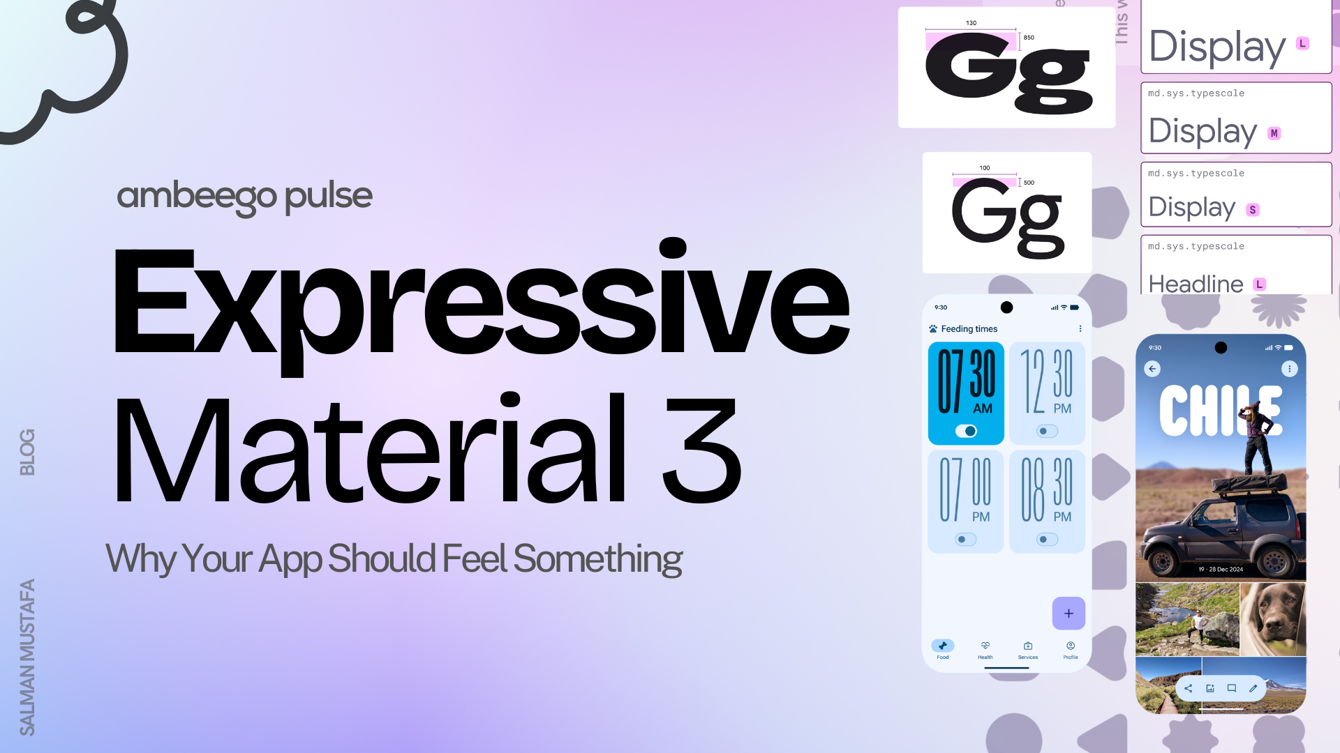
What is M3 Expressive?
It’s Material, but with feeling.
M3 Expressive brings a more vibrant and human layer to apps with:
- Vibrant color
- Intuitive motion
- Bolder shapes
- Flexible typography
- Customizable components
This isn’t just about aesthetics. It performs better, too.
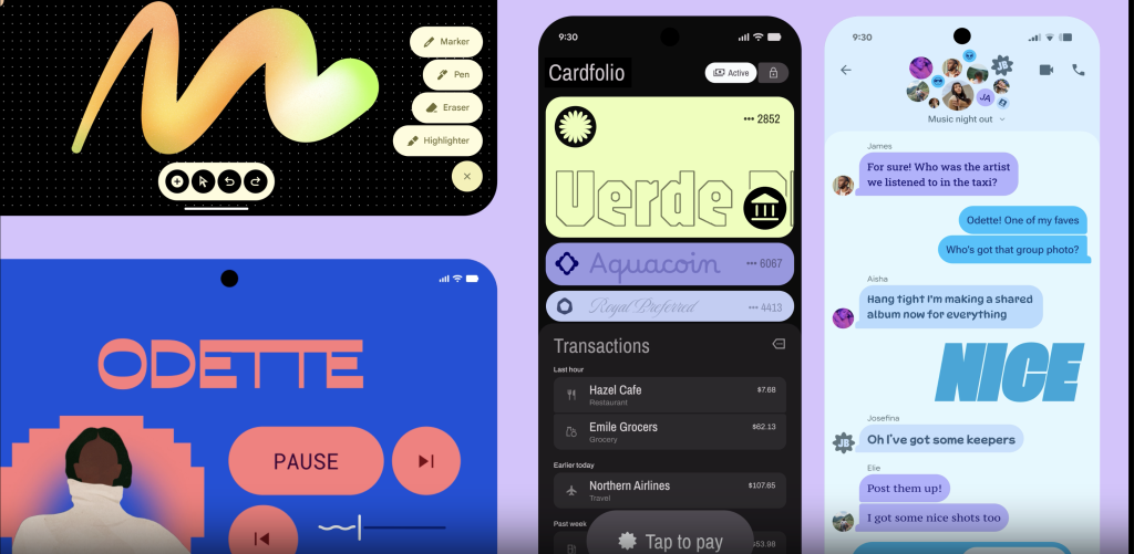
What’s New in M3 Expressive
Here are just a few of the updates:
🔹 Toolbar: A more modern top app bar
🔹 Split Button: Combines primary action + dropdown
🔹 Button Groups: Visually connected action clusters
🔹 Progress Indicators: Now with a dynamic waveform style
🔹 15+ Components: Redesigned for impact and emotion
A New Motion Physics System
Motion is no longer just flair. It’s functional.
M3 introduces a token-based motion system:
- Easier to customize
- Smoother transitions
- Feels more intentional and expressive
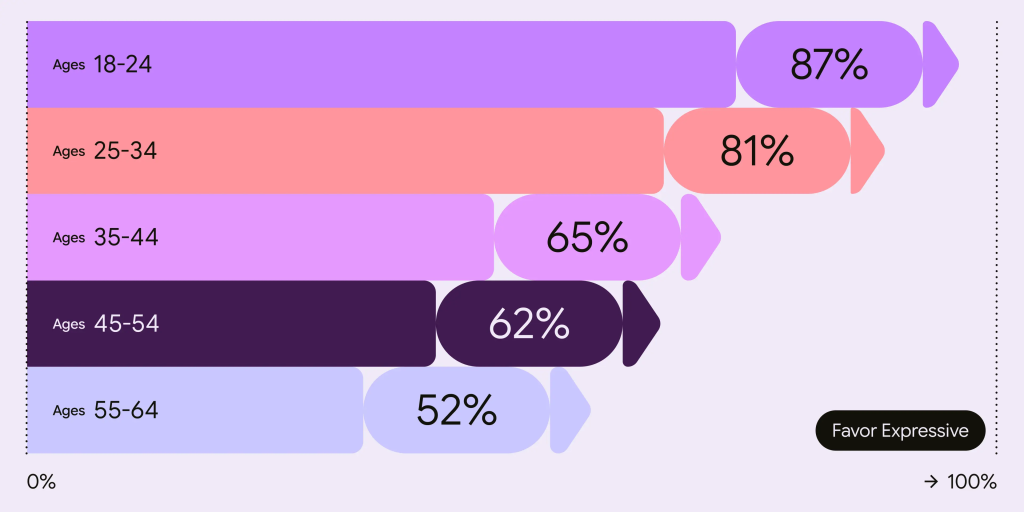
Why This Actually Matters
M3 Expressive isn’t just prettier
It’s proven.
In research-backed testing:
- 👁 Users spotted key actions 4x faster
- 🧠 Older adults (45+) understood UI faster
- 💬 Interfaces rated as more intuitive and modern
That’s a win for accessibility, usability, and performance.
Expressive Design Drives Emotion
In perception studies, M3 Expressive UIs were rated:
- +34% more modern
- +32% more subcultural appeal
- +30% more rebellious
Ideal for brands seeking to feel fresh, bold, and human.
But It’s Not a Free Pass
With great design power comes great UX responsibility.
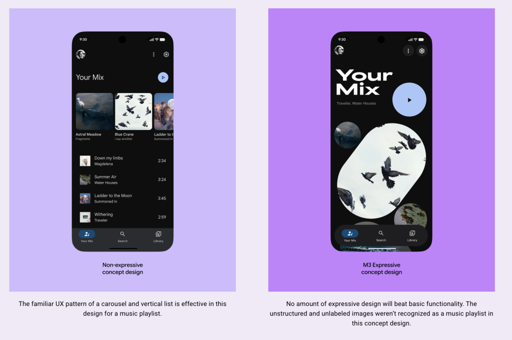
Misusing expressive tools (like removing labels or reordering UI just for style) reduced usability in some tests (right image).
Expressive doesn’t mean decorative. Expressive means intentional.
Good Design = Inclusive Design
Here’s the most exciting bit:
In testing, older users performed as well as younger users when using M3 Expressive designs.
That means:
✅ Less friction for everyone
✅ More people completing tasks faster
✅ Apps that age gracefully with your audience
TL;DR: Time to Make Your App Feel Something
Material 3 Expressive is:
- Research-backed
- Visually bold
- Emotionally resonant
- Easier to use
- Better for everyone
This is design that connects.
Ready to Explore?

Are you thinking about migrating your UI to M3 Expressive?
Let’s discuss what that migration could look like for your app.